App:Library:Squareline:docs:dev env:widgets

Widget panel
| 原文 | 訳 |
|---|---|
| You can find widgets, which are the basic elements of UI, on the Widget Panel.
Every widget has its own preference. You can add custom styles to widget components and you are allowed to configure them in different states. |
ウィジェット パネルには、UI の基本要素であるウィジェットがあります。
すべてのウィジェットには独自の設定があります。 カスタム スタイルをウィジェット コンポーネントに追加でき、それらをさまざまな状態で構成できます。 |
Screen

|
It defines the resolution of the work space and widgets can be added here. You can create several screens to your project. To switch among screens, you should use Screen Change event.
|
ワークスペースの解像度を定義し、ここにウィジェットを追加できます。 プロジェクトに複数の画面を作成できます。 画面を切り替えるには、Screen Change イベントを使用する必要があります。
|
Basic widgets
| Basic widgets category includes main components.
These are the most important elements of the screen. |
基本的なウィジェット カテゴリには、主要なコンポーネントが含まれます。
これらは、画面の最も重要な要素です。 |
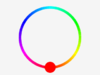
Arc

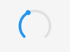
You can draw an arc or create an interactive circle slider by using Arc widget. The arc consists of three elements:
- Background - The background of the arc
- Indicator - Using the arc as a curved bar, it indicates its value
- Knob - Using the arc as a curved slider, it gives a knob to the slider
Parameters of Arc Widget
- Range min, max - It defines the minimum and maximum values of the arc
- Value - Starter value
- Bg start, end angle - Start / End angle of the background in degrees
- Start, end angle - Start / End angle of the indicator in degrees
- Mode - You can choose from 3 different modes.
- Normal - The indicator arc is drawn from the minimum value to the current.
- Reverse - The indicator arc is drawn counter-clockwise from the maximum value to the current.
- Symmetrical - The indicator arc is drawn from the middle point to the current value.
- Rotation - An offset to the 0 degree position can be added
Style parts
- Main
- Indicator
- Knob
アーク ウィジェットを使用して、アークを描画したり、インタラクティブなサークル スライダーを作成したりできます。 円弧は次の 3 つの要素で構成されます。
- 背景 - 円弧の背景
- インジケーター - 円弧を曲線のバーとして使用し、その値を示します
- ノブ - 円弧をカーブしたスライダーとして使用し、スライダーにノブを与えます
アークウィジェットのパラメータ
- 範囲最小、最大 - 円弧の最小値と最大値を定義します
- 値 - スターター値
- Bg start, end angle - 背景の開始/終了角度 (度単位)
- 開始、終了角度 - インジケーターの開始/終了角度 (度単位)
- モード - 3 つの異なるモードから選択できます。
- 通常 - インジケーター アークは、最小値から現在まで描画されます。
- リバース - インジケーター アークは、最大値から現在まで反時計回りに描かれます。
- 対称 - インディケータ アークは、中間点から現在の値まで描画されます。
- 回転 - 0 度の位置へのオフセットを追加できます
Style parts
- Main
- Indicator
- Knob
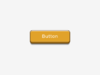
Button
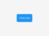
Button is a basic object. By using it, you can create a button fast and easily.
Style part
- Main
ボタンは基本オブジェクトです。 これを使用すると、すばやく簡単にボタンを作成できます。
Style part
- Main
Image
By using Image widget, images in the Asset folder are displayed.There are two options to display the images in the Asset folder.
You can add an Image widget to the screen and set the image to be displayed or you can simply drag the preferred image from the Asset folder to the screen therefore it will appear automatically.
Parameters of Image Widget
- Asset - You can select the image to be displayed on the widget from the image list in the Asset folder.
- Pivot X, Y - Pivot is the rotation and zoom center of the image.
- Rotation - Rotation angle in degrees.
- Scale - Scale for zooming in or out.
Style part
- Main
画像ウィジェットを使用すると、Asset フォルダー内の画像が表示されます。 Asset フォルダー内の画像を表示するには、2 つのオプションがあります。
画像ウィジェットを画面に追加して表示する画像を設定するか、好みの画像を Asset フォルダーから画面にドラッグするだけで自動的に表示されます。
画像ウィジェットのパラメータ
- Asset - Assetフォルダー内の画像一覧から、ウィジェットに表示する画像を選択できます。
- ピボット X、Y - ピボットは、画像の回転とズームの中心です。
- Rotation - 度単位の回転角度。
- スケール - ズームインまたはズームアウトのスケール。
Style part
- Main
Label
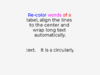
By using a Label Widget, you can add text to the screen.
Parameters of Label Widget
- Label mode - You can choose different solutions for too long lines.
- Wrap - Wrap too long lines.
- Dot - Replaces the last 3 characters from the bottom right corner of the label with dots.
- Scroll - If the text is wider than the label, scroll it horizontally back and forth. If it's higher, scroll vertically. Only one direction is scrolled and horizontal scrolling has higher precedence.
- Scroll circular - If the text is wider than the label, scroll it horizontally continuously. If it's higher, scroll vertically. Only one direction is scrolled and horizontal scrolling has higher precedence.
- Clip - Clip the end of the text if the text is wider than the label.
- Text - You can add the text to be displayed.
- Recolor - In the text, you can use commands to recolor parts of the text. For example:
"Write a #ff0000 red# word".
Style part
- Main
ラベル ウィジェットを使用すると、画面にテキストを追加できます。
ラベルウィジェットのパラメータ
- ラベル モード - 長すぎる行に対して別のソリューションを選択できます。
- 折り返し - 長すぎる行を折り返します。
- ドット - ラベルの右下隅の最後の 3 文字をドットに置き換えます。
- スクロール - テキストがラベルよりも広い場合は、前後に水平にスクロールします。 高い場合は、縦にスクロールします。 スクロールは一方向のみで、横方向のスクロールが優先されます。
- 循環スクロール - テキストがラベルよりも広い場合は、水平に連続してスクロールします。 高い場合は、縦にスクロールします。 スクロールは一方向のみで、横方向のスクロールが優先されます。
- クリップ - テキストがラベルよりも広い場合、テキストの末尾をクリップします。
- テキスト - 表示するテキストを追加できます。
- 色の変更 - テキストでは、コマンドを使用してテキストの一部の色を変更できます。 例: 「#ff0000 red# 単語を書きます」。
Style part
- Main
Panel
Text Area


Controller widgets
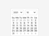
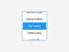
Calendar
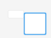
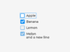
Checkbox
Colorwheel
Dropdown
Image button
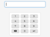
Keyboard
Roller
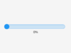
Slider
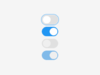
Switch


Visualiser widgets
| Visualiser widgets are those elements that are for displaying. | ビジュアライザー ウィジェットは、表示用の要素です。 |
Bar
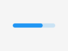
The bar widget has a background and an indicator on it.The width of the indicator is set according to the current value of the bar. Vertical bars can be created if the width of the object is smaller than its height.
Not only the end, but also the start value of the bar can be set, which changes the start position of the indicator.
Parameters of Bar Widget
- Min, Max - To specify the range (min, max values).
- Value - Defines the current value.
- Animate - Changes into the new value with an animation.
- Anim time - Defines animation time.
Style parts
- Main
- Indicator
バー ウィジェットには背景とインジケーターがあります。インジケーターの幅は、バーの現在の値に従って設定されます。 オブジェクトの幅が高さよりも小さい場合、垂直バーを作成できます。
終了値だけでなく、バーの開始値も設定できます。これにより、インジケーターの開始位置が変更されます。
バーウィジェットのパラメータ
- Min, Max - 範囲を指定します (最小値、最大値)。
- Value - 現在の値を定義します。
- Animate - アニメーションで新しい値に変更します。
- Anim time - アニメーション時間を定義します。
Style parts
- Main
- Indicator
Chart
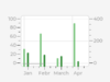
Charts are a basic objects to visualize data points.Currently Line charts (connect points with lines and/or draw points on them) and Bar charts are supported.
Chart Widgets have limited functions in the editor.
Charts can have:
- division lines
- 2 y axis
- axis ticks and texts on ticks
- cursors
- scrolling and zooming
Style parts
- Main
- Items
- Indicator
チャートは、データ点を視覚化するための基本的なオブジェクトです。現在、ラインチャート(点と点を線で結んだり、点に点を描いたりする)とバーチャートがサポートされています。
チャートウィジェットはエディタでの機能が制限されています。
チャートには以下の機能があります。:
- 分割線
- 2つのY軸
- 軸の目盛りと目盛りのテキスト
- カーソル
- スクロールとズーム
Style parts
- Main
- Items
- Indicator
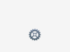
Spinner
The Spinner object is a spinning arc over a ring.
Style parts
- Main
- Arc
Spinnerオブジェクトは、リングの上で円弧を回転させます。
Style parts
- Main
- Arc


