App:Library:Squareline:docs:dev env:widgets

Widget panel
| 原文 | 訳 |
|---|---|
| You can find widgets, which are the basic elements of UI, on the Widget Panel.
Every widget has its own preference. You can add custom styles to widget components and you are allowed to configure them in different states. |
ウィジェット パネルには、UI の基本要素であるウィジェットがあります。
すべてのウィジェットには独自の設定があります。 カスタム スタイルをウィジェット コンポーネントに追加でき、それらをさまざまな状態で構成できます。 |
Screen

|
It defines the resolution of the work space and widgets can be added here. You can create several screens to your project. To switch among screens, you should use Screen Change event.
|
ワークスペースの解像度を定義し、ここにウィジェットを追加できます。 プロジェクトに複数の画面を作成できます。 画面を切り替えるには、Screen Change イベントを使用する必要があります。
|
Basic widgets
| Basic widgets category includes main components.
These are the most important elements of the screen. |
基本的なウィジェット カテゴリには、主要なコンポーネントが含まれます。
これらは、画面の最も重要な要素です。 |
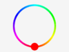
Arc

You can draw an arc or create an interactive circle slider by using Arc widget. The arc consists of three elements:
- Background - The background of the arc
- Indicator - Using the arc as a curved bar, it indicates its value
- Knob - Using the arc as a curved slider, it gives a knob to the slider
Parameters of Arc Widget
- Range min, max - It defines the minimum and maximum values of the arc
- Value - Starter value
- Bg start, end angle - Start / End angle of the background in degrees
- Start, end angle - Start / End angle of the indicator in degrees
- Mode - You can choose from 3 different modes.
- Normal - The indicator arc is drawn from the minimum value to the current.
- Reverse - The indicator arc is drawn counter-clockwise from the maximum value to the current.
- Symmetrical - The indicator arc is drawn from the middle point to the current value.
- Rotation - An offset to the 0 degree position can be added
Style parts
- Main
- Indicator
- Knob
アーク ウィジェットを使用して、アークを描画したり、インタラクティブなサークル スライダーを作成したりできます。 円弧は次の 3 つの要素で構成されます。
- 背景 - 円弧の背景
- インジケーター - 円弧を曲線のバーとして使用し、その値を示します
- ノブ - 円弧をカーブしたスライダーとして使用し、スライダーにノブを与えます
アークウィジェットのパラメータ
- 範囲最小、最大 - 円弧の最小値と最大値を定義します
- 値 - スターター値
- Bg start, end angle - 背景の開始/終了角度 (度単位)
- 開始、終了角度 - インジケーターの開始/終了角度 (度単位)
- モード - 3 つの異なるモードから選択できます。
- 通常 - インジケーター アークは、最小値から現在まで描画されます。
- リバース - インジケーター アークは、最大値から現在まで反時計回りに描かれます。
- 対称 - インディケータ アークは、中間点から現在の値まで描画されます。
- 回転 - 0 度の位置へのオフセットを追加できます
Style parts
- Main
- Indicator
- Knob
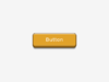
Button
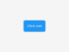
Button is a basic object. By using it, you can create a button fast and easily.
Style part
- Main
ボタンは基本オブジェクトです。 これを使用すると、すばやく簡単にボタンを作成できます。
Style part
- Main
Image
By using Image widget, images in the Asset folder are displayed.There are two options to display the images in the Asset folder.
You can add an Image widget to the screen and set the image to be displayed or you can simply drag the preferred image from the Asset folder to the screen therefore it will appear automatically.
Parameters of Image Widget
- Asset - You can select the image to be displayed on the widget from the image list in the Asset folder.
- Pivot X, Y - Pivot is the rotation and zoom center of the image.
- Rotation - Rotation angle in degrees.
- Scale - Scale for zooming in or out.
Style part
- Main
画像ウィジェットを使用すると、Asset フォルダー内の画像が表示されます。 Asset フォルダー内の画像を表示するには、2 つのオプションがあります。
画像ウィジェットを画面に追加して表示する画像を設定するか、好みの画像を Asset フォルダーから画面にドラッグするだけで自動的に表示されます。
画像ウィジェットのパラメータ
- Asset - Assetフォルダー内の画像一覧から、ウィジェットに表示する画像を選択できます。
- ピボット X、Y - ピボットは、画像の回転とズームの中心です。
- Rotation - 度単位の回転角度。
- スケール - ズームインまたはズームアウトのスケール。
Style part
- Main
Label
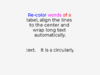
By using a Label Widget, you can add text to the screen.
Parameters of Label Widget
- Label mode - You can choose different solutions for too long lines.
- Wrap - Wrap too long lines.
- Dot - Replaces the last 3 characters from the bottom right corner of the label with dots.
- Scroll - If the text is wider than the label, scroll it horizontally back and forth. If it's higher, scroll vertically. Only one direction is scrolled and horizontal scrolling has higher precedence.
- Scroll circular - If the text is wider than the label, scroll it horizontally continuously. If it's higher, scroll vertically. Only one direction is scrolled and horizontal scrolling has higher precedence.
- Clip - Clip the end of the text if the text is wider than the label.
- Text - You can add the text to be displayed.
- Recolor - In the text, you can use commands to recolor parts of the text. For example:
"Write a #ff0000 red# word".
Style part
- Main
ラベル ウィジェットを使用すると、画面にテキストを追加できます。
ラベルウィジェットのパラメータ
- ラベル モード - 長すぎる行に対して別のソリューションを選択できます。
- 折り返し - 長すぎる行を折り返します。
- ドット - ラベルの右下隅の最後の 3 文字をドットに置き換えます。
- スクロール - テキストがラベルよりも広い場合は、前後に水平にスクロールします。 高い場合は、縦にスクロールします。 スクロールは一方向のみで、横方向のスクロールが優先されます。
- 循環スクロール - テキストがラベルよりも広い場合は、水平に連続してスクロールします。 高い場合は、縦にスクロールします。 スクロールは一方向のみで、横方向のスクロールが優先されます。
- クリップ - テキストがラベルよりも広い場合、テキストの末尾をクリップします。
- テキスト - 表示するテキストを追加できます。
- 色の変更 - テキストでは、コマンドを使用してテキストの一部の色を変更できます。 例: 「#ff0000 red# 単語を書きます」。
Style part
- Main
Panel
Panel Widget is a basic object. By using it, you can create a rectangle which can be transformed freely with styles. You can make rounded corners or add background color, shadows, borders, etc.
Style parts
- Main
- Scrollbar
Panel Widget は基本的なオブジェクトです。 これを使用すると、スタイルで自由に変形できる長方形を作成できます。 角を丸くしたり、背景色、影、境界線などを追加したりできます。
Style parts
- Main
- Scrollbar
Text Area
Text Area is a Basic object with a Label and a cursor on it. Texts or characters can be added to it. Long lines are wrapped and when the text becomes long enough, the Text Area can be scrolled.
Parameters of Text Area Widget
- Placeholder - Unique to Text Area, it allows styling the placeholder text.
- One line mode - The Text Area can be configured to be a single line. In this mode the height is set automatically to show only one line, line break characters are ignored, and word wrapping is disabled.
- Password mode - Text Area works like a password area. Characters are replaced by stars.
- Accepted characters - You can set a list of accepted characters. Other characters will be ignored.
- Max text length - The maximum number of characters can be limited.
Style parts
- Main
- Selected
- Cursor
- Placeholder
テキストエリアは、ラベルとカーソルが描かれたBasicオブジェクトです。テキストエリアには、テキストや文字を追加することができます。長い行は折り返され、十分な長さになるとテキストエリアはスクロールすることができます。
テキストエリアウィジェットのパラメータ
- プレースホルダー - テキストエリア独自の機能で、プレースホルダーテキストにスタイルを設定することができます。
- 一行モード - テキストエリアは一行に設定することができます。このモードでは、1行だけ表示されるように高さが自動的に設定され、改行文字は無視され、単語の折り返しは無効になります。
- パスワードモード - テキストエリアは、パスワードエリアのように動作します。文字は星印に置き換えられます。
- 使用可能な文字 - 使用可能な文字のリストを設定することができます。その他の文字は無視されます。
- 最大テキスト長 - 最大文字数を制限することができます。
Style parts
- Main
- Selected
- Cursor
- Placeholder


Controller widgets
| Here, you can find widgets for controlling. | ここでは、制御用のウィジェットをご紹介しています。 |
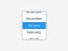
Calendar
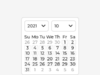
Calendar Widget is a classic calendar which can:
- show the days of any month in a 7x7 matrix
- show the name of the days
- highlight the current day (today)
- highlight any user-defined dates
Parameters of Calendar Widget
- Day, Month, Year - You can define the default date with these parameters.
Style parts
- Main
- Scrollbar
Calendar Widgetは、クラシックなカレンダーです。
- 7x7 マトリックスで任意の月の日を表示します
- 曜日の名前を表示
- 現在の日 (今日) を強調表示する
- ユーザー定義の日付を強調表示します
カレンダーウィジェットのパラメータ
- 日、月、年 - これらのパラメータでデフォルトの日付を定義できます。
Style parts
- Main
- Scrollbar
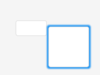
Checkbox
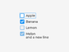
Checkbox Widget consists of a "tick box" object and a label. When Checkbox Widget is clicked, tick box is toggled.
Parameters of Checkbox Widget
- Title - The name of the checkbox displayed next to it.
Style parts
- Main
- Indicator
チェックボックス ウィジェットは、「チェック ボックス」オブジェクトとラベルで構成されます。 チェックボックスウィジェットをクリックすると、チェックボックスがトグルされます。
チェックボックスウィジェットのパラメータ
- タイトル - 横に表示されるチェックボックスの名前。
Style parts
- Main
- Indicator
Colorwheel
As its name implies, Color wheel allows the user to select a color.The Hue, Saturation and Value of the color can be selected separately.
Long pressing the object, the color wheel will change to the next parameter of the color (hue, saturation or value).
A double click will reset the current parameter.
Parameters of Colorwheel Widget
- Mode - You can choose from three color select modes:
- Hue - Full color scale
- Saturation - Saturation of the selected color
- Value - Darker / Lighter version of the selected color
Style parts
- Main
- Knob
その名前が示すように、カラー ホイールを使用すると、ユーザーは色を選択できます。 色の色相、彩度、明度は個別に選択できます。
オブジェクトを長押しすると、カラー ホイールが色の次のパラメーター (色相、彩度、または値) に変わります。
ダブルクリックすると、現在のパラメーターがリセットされます。
カラーホイールウィジェットのパラメータ
- モード - 3 つのカラー選択モードから選択できます。
- 色相 - フルカラースケール
- 彩度 - 選択した色の彩度
- 値 - 選択した色のより暗い/より明るいバージョン
Style parts
- Main
- Knob
Dropdown
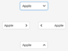
Drop-down Widget is a list that allows the user to select one value from a list. The drop-down list is closed by default and displays a single value or a predefined text. When activated (by clicking on the drop-down list), a list is created from which the user may select one option.
When the user selects a new value, the list is deleted again and displays only the selected value.
The Drop-down list is added to the default group (if it is set). Besides the Drop-down list is an editable object to allow selecting an option with encoder navigation too.
Parameters of Dropdown Widget
- Options - Options are passed to the drop-down list as a string. You can create enlisted elements by adding new lines to the list.
- List align - Position of the list
- Show selected - It shows selected elements.
- Base text - This text appears by default.
- Maximum Height - The maximum height of the list in pixels.
Style parts
- Main
- List
- Selected
ドロップダウン ウィジェットは、ユーザーがリストから 1 つの値を選択できるようにするリストです。 ドロップダウン リストはデフォルトで閉じられており、単一の値または定義済みのテキストが表示されます。 (ドロップダウン リストをクリックして) アクティブにすると、ユーザーが 1 つのオプションを選択できるリストが作成されます。
ユーザーが新しい値を選択すると、リストは再び削除され、選択した値のみが表示されます。
ドロップダウン リストがデフォルト グループに追加されます (設定されている場合)。 また、ドロップダウン リストは編集可能なオブジェクトであり、エンコーダ ナビゲーションでオプションを選択することもできます。
ドロップダウンウィジェットのパラメータ
- オプション - オプションは文字列としてドロップダウン リストに渡されます。 リストに新しい行を追加することで、登録された要素を作成できます。
- List align - リストの位置
- 選択したものを表示 - 選択した要素を表示します。
- ベース テキスト - このテキストはデフォルトで表示されます。
- 最大の高さ - リストの最大の高さ (ピクセル単位)。
Style parts
- Main
- List
- Selected
Image button
The Image button is very similar to the simple 'Button' object.The only difference is that it displays user-defined images in each state instead of drawing a rectangle.
You can set a left, right and center image, and the center image will be repeated to match the width of the object.
Parameters of Image Button Widget
- Button state - Here you can select the state in which you would like to display the image.
- Released
- Pressed
- Disabled
- Checked Released
- Checked Pressed
- Checked Disabled
- Image released - You can select an image to the released state.
Style parts
- Main
画像ボタンは、単純な「ボタン」オブジェクトに非常に似ています。 唯一の違いは、四角形を描画する代わりに、各状態でユーザー定義のイメージを表示することです。
左、右、中央の画像を設定でき、オブジェクトの幅に合わせて中央の画像が繰り返されます。
画像ボタンウィジェットのパラメータ
- ボタンの状態 - ここでは、画像を表示する状態を選択できます。
- リリース済み
- 押された
- 無効
- チェック済み リリース済み
- チェック済み 押された
- チェックあり 無効
- リリースされたイメージ - リリースされた状態のイメージを選択できます。
Style parts
- Main
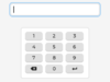
Keyboard
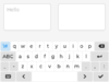
Keyboard allows you to create a virtual keyboard on the screen.
Parameters of Keyboard Widget
- Target text area - Keyboard Widget is a special Button matrix with predefined keymaps and other features to realize a virtual keyboard to write texts into a Text area.
- Mode - The Keyboards have the following modes:
- Text lower - Display lower case letters
- Text upper - Display upper case letters
- Text special - Display special characters
- Number - Display numbers, +/- sign, and decimal dot
- User 1-3 - User-defined modes
Style parts
- Main
- Scrollbar
- Items
キーボードを使用すると、画面上に仮想キーボードを作成できます。
キーボードウィジェットのパラメータ
- ターゲット テキスト エリア - キーボード ウィジェットは、テキスト エリアにテキストを書き込むための仮想キーボードを実現するために、定義済みのキーマップとその他の機能を備えた特別なボタン マトリックスです。
- モード - キーボードには次のモードがあります。
- Text lower - 小文字を表示します
- Text upper - 大文字を表示
- Text special - 特殊文字を表示する
- Number - 数字、+/- 記号、および小数点を表示します
- ユーザー 1-3 - ユーザー定義モード
Style parts
- Main
- Scrollbar
- Items
Roller
Roller allows you to simply select one option from a list by scrolling.
Parameters of Roller Widget
- Options - Options you can select from the Roller list. You can create enlisted elements by adding new lines to the list.
- Text align - Position of the texts
- Mode - Switch between normal and infinite modes
- Normal - You can roll from start to end
- Infinite - You can reroll the list
- Visible row count - Setting the number of elements shown in the list
- Anim time - It defines the anim time during switching between the elements.
Style parts
- Main
- Selected
Roller を使用すると、スクロールしてリストから 1 つのオプションを簡単に選択できます。
ローラーウィジェットのパラメータ
- オプション - ローラー リストから選択できるオプション。 リストに新しい行を追加することで、登録された要素を作成できます。
- テキスト整列 - テキストの位置
- モード - 通常モードと無限モードを切り替えます
- 通常 - 最初から最後まで転がすことができます
- 無限 - リストを再ロールできます
- 表示行数 - リストに表示される要素数の設定
- アニメーション時間 - 要素間の切り替え中のアニメーション時間を定義します。
Style parts
- Main
- Selected
Slider
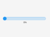
The Slider Widget looks like a Bar supplemented with a knob. The knob can be dragged to set a value.
Just like Bar, Slider can be vertical or horizontal.
Parameters of Slider Widget
- Min, Max - To specify the range (min, max values)
- Mode - The slider can be one of the following modes:
- Normal - A normal slider as described above
- Symmertical - Draw the indicator form the zero value to current value. Requires negative minimum range and positive maximum range.
- Range - Allows setting the start value too. The start value has to be always smaller than the end value.
- Value - Defines the current value of the slider.
- Value left - Defines the current value of the other knob of the slider.
Style parts
- Main
- Indicator
- Knob
スライダーウィジェットは、バーとノブを組み合わせたような形状をしています。 ノブはドラッグして値を設定することができます。
バーと同じように、スライダーも縦長と横長があります。
スライダーウィジェットのパラメーター
- 最小、最大 - 範囲を指定するには (最小値、最大値)
- モード - スライダーは次のいずれかのモードになります。
- 通常 - 上記の通常のスライダー
- 対称 - 指標をゼロ値から現在の値に描画します。 負の最小範囲と正の最大範囲が必要です。
- 範囲 - 開始値も設定できます。 開始値は常に終了値よりも小さくする必要があります。
- Value - スライダーの現在の値を定義します。
- Value left - スライダーのもう一方のノブの現在の値を定義します。
Style parts
- Main
- Indicator
- Knob
Switch
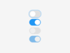
Switch widget looks like a little slider and can be used to turn something on and off.
Parameters of Switch Widget
- Anim time - Defines the animation time between on and off states.
Style parts
- Main
- Indicator
- Knob
Switchウィジェットは、小さなスライダーのような見た目で、何かのスイッチをON/OFFするために使います。
Switch Widgetのパラメータ
- Anim time - オンとオフの間のアニメーションの時間を定義します。
Style parts
- Main
- Indicator
- Knob


Visualiser widgets
| Visualiser widgets are those elements that are for displaying. | ビジュアライザー ウィジェットは、表示用の要素です。 |
Bar
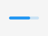
The bar widget has a background and an indicator on it.The width of the indicator is set according to the current value of the bar. Vertical bars can be created if the width of the object is smaller than its height.
Not only the end, but also the start value of the bar can be set, which changes the start position of the indicator.
Parameters of Bar Widget
- Min, Max - To specify the range (min, max values).
- Value - Defines the current value.
- Animate - Changes into the new value with an animation.
- Anim time - Defines animation time.
Style parts
- Main
- Indicator
バー ウィジェットには背景とインジケーターがあります。インジケーターの幅は、バーの現在の値に従って設定されます。 オブジェクトの幅が高さよりも小さい場合、垂直バーを作成できます。
終了値だけでなく、バーの開始値も設定できます。これにより、インジケーターの開始位置が変更されます。
バーウィジェットのパラメータ
- Min, Max - 範囲を指定します (最小値、最大値)。
- Value - 現在の値を定義します。
- Animate - アニメーションで新しい値に変更します。
- Anim time - アニメーション時間を定義します。
Style parts
- Main
- Indicator
Chart
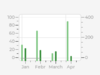
Charts are a basic objects to visualize data points.Currently Line charts (connect points with lines and/or draw points on them) and Bar charts are supported.
Chart Widgets have limited functions in the editor.
Charts can have:
- division lines
- 2 y axis
- axis ticks and texts on ticks
- cursors
- scrolling and zooming
Style parts
- Main
- Items
- Indicator
チャートは、データ点を視覚化するための基本的なオブジェクトです。現在、ラインチャート(点と点を線で結んだり、点に点を描いたりする)とバーチャートがサポートされています。
チャートウィジェットはエディタでの機能が制限されています。
チャートには以下の機能があります。:
- 分割線
- 2つのY軸
- 軸の目盛りと目盛りのテキスト
- カーソル
- スクロールとズーム
Style parts
- Main
- Items
- Indicator
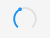
Spinner
The Spinner object is a spinning arc over a ring.
Style parts
- Main
- Arc
Spinnerオブジェクトは、リングの上で円弧を回転させます。
Style parts
- Main
- Arc


